
Hi!
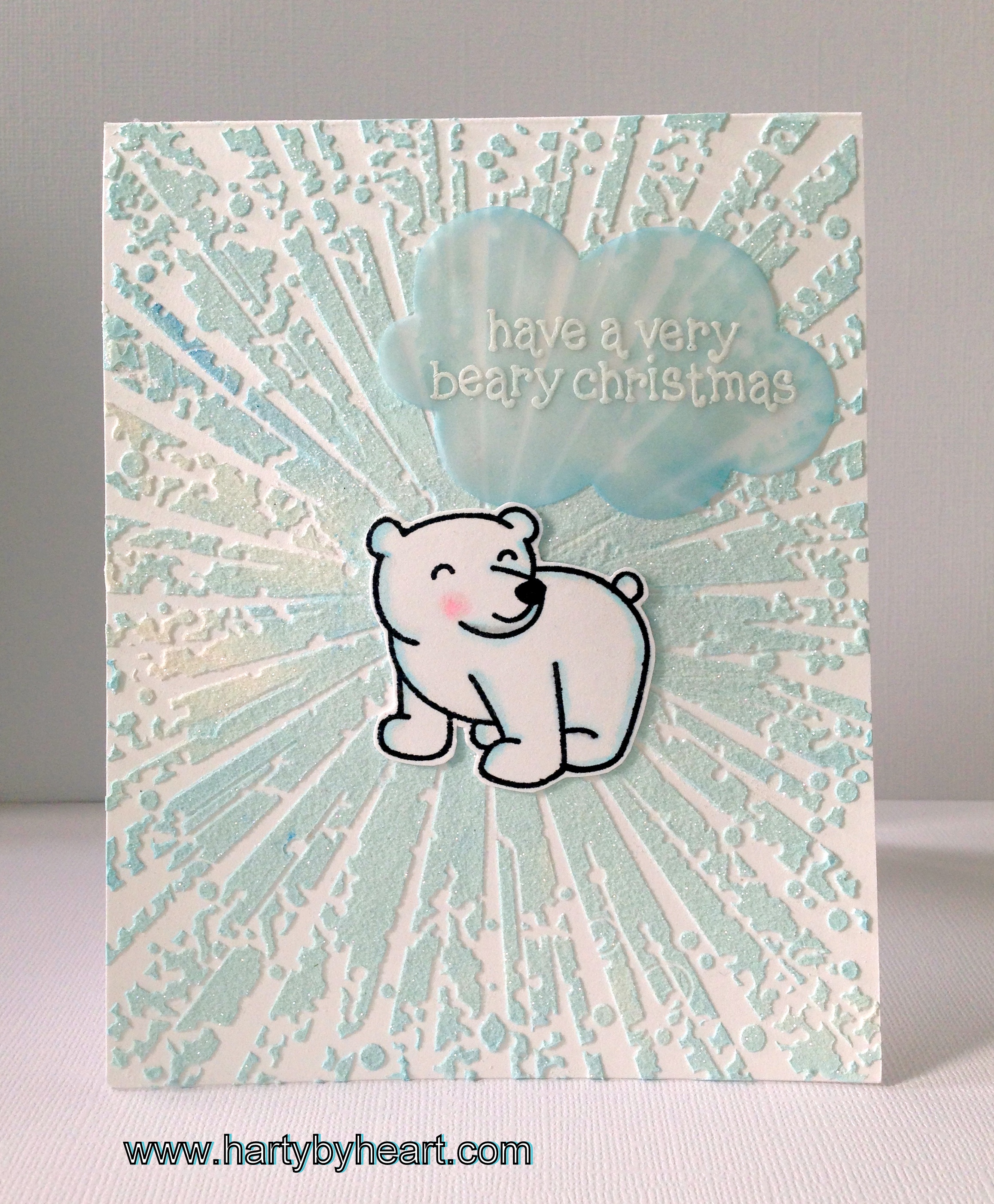
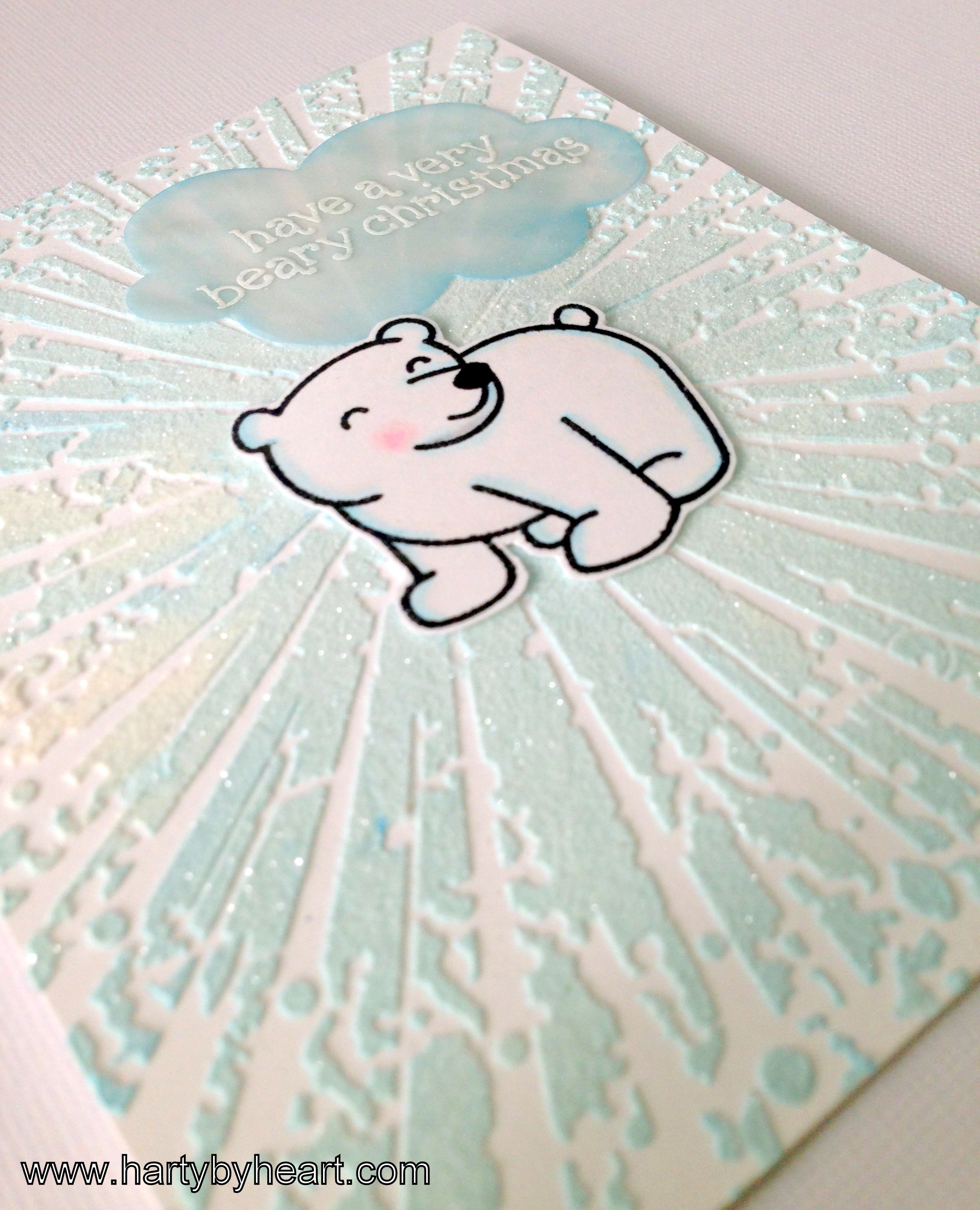
Guess what, I managed do do another christmas card today. 🙂 I used my favorite stencil from Memory box to create the background. I went for the blue snow glitter explosion look. Never heard of it? Me neither actually but I thought it would look cool and I like how this card turned out. 🙂
I made a video of the process, normally I try to upload a video each week but during the summer time my craft time has been limited to say the least. But now I will try to go back to my usual routines and share a video on a weekly basis. I love making them and your sweet comments make me really really happy. 🙂
Take care and have a good one!
Challenges : Lawnscaping, Less is More
Supplies:
- Stampset – Lawn Fawn, Critters in the snow and Pa-rum-pa-pum-pum
- Stencil – Memory box, style 88559
- Die Simon Says Stamp, Talk Bubbles
- Cardstock – Neenah Solar White
- Vellum
- Ink – Memento black and versamark
- Embossing Powder – Ranger, detail white
- Martha Stewarts fine crystal glitter
- Distress ink – Salty Ocean
- Copics
- Wink of stella glitter marker
- Modeling paste from Panduro Hobby
Oh my, this is gorgeous!! That background looks awesome! Thanks for playing along with us at Lawnscaping!! 🙂
This looks super Joanna, what a great embossing folder and the colour you made the paste looks terrific. The glitter adds the perfect touch!
Thanks once more
Chrissie
“Less is More”
Ooooh wow! Another stunner.
Love the embossed snowy look
Thanks again for sharing
Sarah
Less is More
I enjoyed your video and love the bear Christmas card. I appreciate you showing the processes you went through. I see most colorists use a gray to add shadow to white. Why did you use blue?
I’m so happy to hear that you enjoyed the video! I almost always use blue when I shadow white, but sometimes I use light gray as well. In this case I was picturing the “blue glitter snow explosion” kind of thing, and I used blue shading to match my embossing paste. I think both options ( blue or grey ) work fine for shading white images, but I seem to reach for blue, I think it look really crisp and I really get a snowy felling, 🙂
I love this card. I also use a very pale blue for snowy shadows, rather than a grey, as I find grey makes the snow look grubby! To me grey shading would be for a rain cloud.
Pat, thank you for leaving me such a sweet comment. I agree, most of the time I use a pale blue shadowing snow. I usually use my grays for a rainy cloud, but sometimes I think it’s suitable for snow as well. If the pallet is gray, I think it works . 🙂
Joanna what a striking background for this cutie!
Thank you for joining this week’s Less is More Challenge, animals.
Anne
LIM Designer
Härligt kort!
Riktigt snyggt kort! Vad duktig du är!
This is gorgeous! I love that background. It looks like the polar bear has shattered through the ice or something. I subscribed so I can come back and watch the video later. Can’t wait! Thanks so much for playing with us at Lawnscaping!
Super adorable – and you bg is absolutely AMAZING! TFS!
wow, så snyggt! Bakgrunden är verkligen effektfull och du har verkligen fått till en snö-explosion-känsla 🙂 Du gör så fina kort och är en riktig inspirationskälla.
Love this!
super cool! I Love the stencil!
You may find two to three new levels inside L. a. Weight loss and any one someone is incredibly important. Initial stage may be real melting away rrn the body. lose weight